White done right...


I must say, this issue of Lonny Magazine is pretty good. I love the apartment of Michelle Adams,  editor-in-chief of the mag. White walls are so my thing right now and I really like how she splattered art all over the walls to keep it colorful and filled. This cute bedroom is totally New York City Chic. 
Femme artwork is a must in any killer girl apartment. Love the hints of pink too. I also really dig this little entryway vignette. All white everything and a little modern artsy kelly wearstler vibe going on. Yes. I love everything about it. 
all images by Patrick Cline (my photog hero) for Lonny mag.

Secret of domestic bliss #71...Antiques; the good wood

It's official. I am becoming an upper east sider this next month. Finally found an apartment that fits all my favorite furnishings. I have grown out of my adorable little studio so quickly but its going to be so hard to let it go. I have so many wonderful memories here. The upper west side will forever have a place in my heart. At first I was considering parting ways with all of my furniture and just getting all new pieces. However, there is one that I will never part with and that is my beautiful antique wood dresser that was my very first furniture purchase here in NYC. It's made so beautifully and will live with me forever. I am convinced that no apartment or home is complete without a beautiful antique wood dresser...
Above is my gorgeous wood beauty. Scored her for $100 and I have been in love with her ever since we first met. 
While for a minute I was contemplating painting my antique dresser in a vivid lacquer my gut was absolutely resisting it. I have to allow the woods  natural beauty and pattern to shine. Sometimes natural beauty is so much better. 
Each of these photos is from Lonny Mag (ever filled with mad decor inspiration), where my favorite photog Patrick Cline gets the details of each of these gorgeous wood numbers so perfectly. Every piece inspires me so much for new looks for my space. Definitely gotta get some fabulous mirror to sit atop my lovely antique.

images via lonny magazine

Lessons I Learned from Lonny...

I love what I do. Have I mentioned this lately? I am constantly getting emails asking for my advice from young students or those who want to change their careers and get into interior design. What's the best way you can learn how to develop your craft? 
My answer is probably one of my favorite pastimes, research & development. Practice decorating your own space and use it as a laboratory. The other part, indulge yourself obsessively in books and magazines in your field of choice. Continue learning. This last issue of Lonny, really did that for me...

LESSON #1: I was so inspired by the content in this issue, I really feel that I learned a few new things, actually old things but looking at them in a whole new way.
In these first two photos, I'm noticing the magic of white chairs with black legs. Separating the pair on either sides of the sofa makes for a really open and symmetrical look creating the perfect conversation space. 
LESSON #2: Busts and statues still are ultimate accessory for areas where you don't know what to put. When in doubt, throw one in the mix and let the magic unfold.
LESSON #3: There are a few essential pieces for the new stylish bar cart... A fabulous wooden antique  sideboard + a cherry blossom chinoiserie screen + sterling silver serving trays + gorgeous glasses. There you will have a winning combination.
LESSON #4: Horse art is happening! It is still some of the most stylish art I see out there. Groups of them together make for such sweet swagger. 
  LESSON # 5: Collections are cooler as clutter when displayed in color groups! Say that a few times fast. 
 all images via Patrick Cline for Lonny magazine

How to live chic in New York...Lonny Magazine style

As most of you know, my obsession with the doors of my wonderful city just had me on one...I. cant. stop. Every time I snap a photo of a new door, my imagination runs wild with what could be inside these incredible apartment spaces. Every once and a while someone has their drapes pulled back and you can see inside and gaze at the lovely decor. I love this, but hank goodness for Lonny mag, who gave me a glimpse inside one of the most fabulously decorated NYC apartments I have seen in a while...

An ultra fabulous gal Jessika Goranson, tricked out her upper east side apartment with some serious panache. Layers and super chic accessories make this apartment all about the details. I really love the way she styled it up. First. WALLPAPERED HALLWAYS. I think it's such a good idea. In my own apartment I painted my hallway with stripes, it makes the whole area seem bigger. 
POPS OF PINK. Her style is pretty feminine but its not too over the top. This pop of pink is perfect, don't you think?
 She styles things up really well and has a collection of dogs and little figurines would that make any true traditional decorista swoon.
 
 
 Alas, a perfectly decorated hallway for New York City and a collection of horse art, that just seals the deal. So very upper east side and so very swanky. Fab job Jess.
images via Patrick Cline for Lonny...

MALACHITE MAJESTY

 There is nothing that I love more than some drama in design. This month's issue of Lonny magazine really brought new inspiration to my little decorista eyes. The Tony Duquette feature is absolutely incredible and oozing with drama and opulence. His signature pattern, Malachite, is on full display here in his grand estate with leopard prints, velvets, black and white flooring and all the deliciousness a decorator could ever dream of...

 
If this desk is not my dream desk for my home office space, well then I don't know what is. This photo makes me want to put a tassle on my desk drawer stat. It's always the little details that say the most. 
 This bathroom is just beyond. All the elements of malachite in this space are absolute perfection. I am always a fan of repeating a pattern over and over. It really adds a special finishing touch that makes a space look decorated on purpose...It's just soooooo good! 


images via lonny magazine photography by patrick cline

LOVING LONNY LIVING...an NYC editor's buduoir

My brain is absolutely excited that the weekend is here, despite the rain I am thoroughly enjoying finally staying in the city for the weekend. No traveling for the entire month, thank goodness! It's time for me to get things organized and clear out the things I don't use anymore (Jen totally inspired me). 
More than that what I will be spending my weekend doing is getting a clear vision of what I want for my new apartment. So, as I was catching up on my favorite online glossies, I stumbled upon Michelle Adam's of Lonny Magazine and her gorgeous new bedroom. I am such a sucker for canopy beds and in this issue she details just how she did it so you can do it too...

 I really am impressed by the way she kept things simple and white. White walls are so my weakness right now. I think it really works in a super modern space with lots of natural light like hers. Black, white and gold elements just are pure perfection in this space without being boring. I'm a fan of panache, you know, living with flamboyance and flair. That means not being afraid to mix leopard, bold florals and some sparkle. Michelle did this while still keepings things sophisticated looking, which I absolutely love. 
 She even got a little Kelly Wearstler-esque by using abstract and geometric accessories. Such glamour without over doing it. This bedroom is a total win win for me! I am seriously chomping at the bits to decorate my new bedroom. 

images via lonny magazine photos by patrick cline

office space of the day... fit for a hip chick

There is so much goodness still to share from the last issue of Lonny.
gorgeous desk lamp + fun inspiration board + perfectly pink and glass desk + sexy shape seating = 
domestic bliss
More things in Lonny that I LOVED...

Loving the moments of turquoise in the magazine, I am thinking there is a resurgence of blue moments happening...
  That brass lamp. If you have been reading me for a while, you know I used one in my FL project and I have been in love with them every since. So good! That blue statue too is the perfect dash of eccentric kelly wearstler style glamour. 
 I love the styling in this little fireplace vignette...
 Hello Parisian citrus magic.
 Lately I am loving some blue and white pieces mixed in, this look never goes out of style.
images via lonny mag by patrick cline.

LONNY LOVES COLOR...

 This new issue of Lonny is oh so good! There is way too much goodness inside, I think I have skimmed the pages more than once. My most favorite feature was this incredibly colorful and whimsical home decorated by my lady friend, Jaime Mears. Move over Jonathan Adler, this girl has got some new fun color and whimsical talent thats taking over...

 I cannot get over the patterns and different art used throughout the home, the homeowners must be such fun people to hang out with. 
 This living room is such fun. Pretty traditional with unexpected elements of funk and drama...like a leopard ottoman. 

 Anything Jackie O wins in my book...am I right?


 Such sensational styling...

 Oh, and lets not forget my favorite...black and white stripes.

photos via lonnymag, photography by Patrick Cline

Office space of the day... the offices of Lonny

Since yesterday I raved about my obsession for Domino, today I had to share my latest favorite office space craze...(especially since its the office of ex-domino editors). Welcome to the offices of Lonny. So stylish and fun, how fun would a day of work be like in the likes of these well decorated rooms? I am smitten with the beautiful white brick walls and the great artwork. Artwork always speaks volumes to me about the chic-ness of a space. Right behind that is lighting and the gorgeous chrome arch lamp...i LOVE it.


office space of the day...west elm infused home tour

fab white desk + plush office chair + gorgeous big lamp + zebra tray + horsie art =
domestic bliss

Oh that Lonny magazine just never gets old to me...the latest issue is absolutely fabulous. My favorite space is the space of Angel Dormer, West Elm's Style Manager. Her Manhattan apartment caught my eye at first sight (especially her super hip office space). It's stylish, playful and full of vintage style that would make any girl swoon. Totally based on 60's decor, she nails that modern/chic california vibe that I have always adored.

Take a moment with me and revel in her marvelous decor style.


needing. wanting. loving. {velvety green gorgeousness}

I am just completely smitten with the sophistication of this room from Celerie Kemble's lonny spread.
First of all, the woman is a genius with decor, the execution of her vintage & modern combos is completely majorly spot on. Oh, how I love the deep rich green with wood chair and ottoman pairings. How about the black side table with gold embellishments, so glamorous. This is definitely a note-worthy look. I want it all now.

The newest online shelter publication: Trad Home

Stop the presses! WWW just announced a new online shelter mag coming this next year, Trad Home. The stylish duo behind Lonny (michelle adams & patrick cline) will be collab-ing with the people behind Traditional Home and bringing their very best! I am beyond thrilled as Tradtional Home & Lonny (aka the current domino)  are 2 of my FAVORITE magazines. So many new mags, I'm loving all of this ambition!

The Art of Living...how to display art {the lonny magazine way}

Perfecting the art of displaying your art is something that is learned over time.
There are various different approaches to the execution, there will never be a perfect way.
What I can tell you is that when carefully done and thought out, 
the proper presentation naturally happens
and the outcome can be magnificent (even if you aren't a decorator).
In the latest issue of Lonny Magazine,
(october-november 2010...go take a look its sooooo good!),
I found so many fantastic images that are sure to inspire your inner art gallerina!
all images and interior design/decor ideas via Lonny Magazine

Team RUE


Check out the CURBED.COM article on Rue vs. Lonny.
I think I am totally team RUE...and super honored to be mentioned!

check out the stats...

Rue:
Founded by: Editor-in-chief Crystal Gentilello, of Plush Palate; executive editor Anne Sage, of The City Sage; managing editor Alaina Kaczmarski of Live Creating Yourself; and Caitlin Flemming of Sacramento Street.
Issue: September/October 2010.
Page count: 261.
Cover star: Ron Woodson and Jamie Rummerfield of LA-based Woodson + Rummerfield House of Design.
Ad on the inside cover: Mitchell Gold + Bob Williams.
Table of Contents ads: New York Design Center, Fine Linen & Bath, The Beautiful Life, DesignLoveFest.com.
Size of editorial masthead (including art staff; excluding interns): 7
Notable contributor: Ashlina Kaposta, aka The Decorista
Best in "Shopping Cart" front-of-book section: A page incorporating moody, layered fall florals into home decor, clothes and accessories.
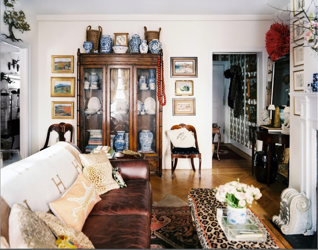
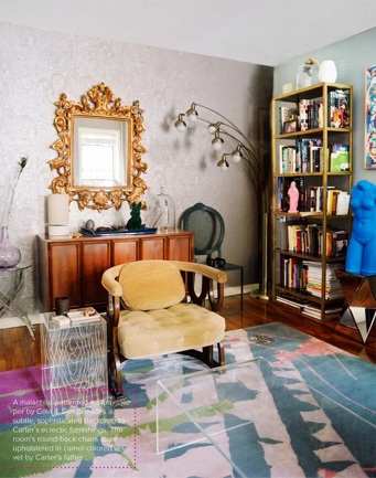
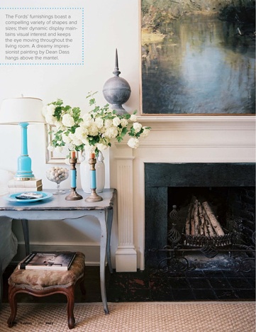
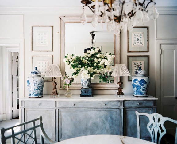
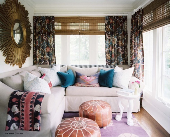
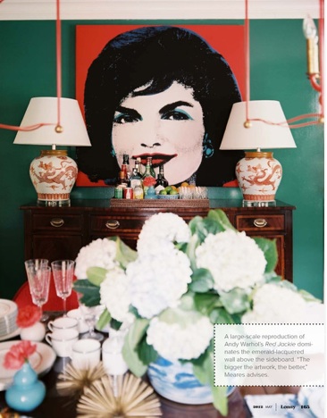
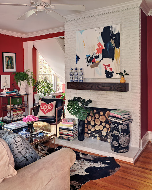
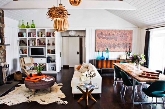
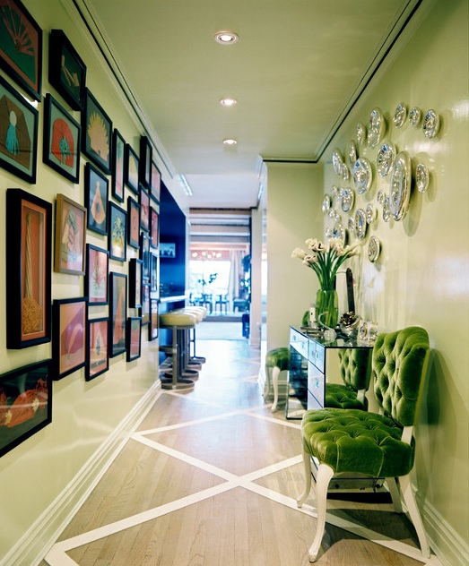
Features: An apartment at downtown LA's Ritz-Carlton Residences designed by Woodson + Rummerfield House of Design; San Francisco bungalow of blogger Victoria Smith of sfgirlbybay; a day in the life of Vicente Wolf; a dinner party with HGTV Design Star winner Emily Henderson; the Brooklyn loft of Hayden-Harnett designers Toni Hacker and Ben Harnett; 
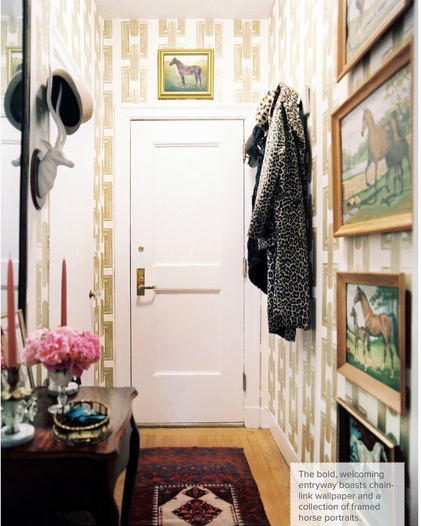
Rue founder Crystal Gentilello at home in Chicago; Buckingham Interiors' Julia Edelman's Chicago residence; a bright birthday party for accessories label Bando; a Mary Douglas Drydale-designed space in Washington, D.C.; a home in Dallas, Texas. 
Lonny:

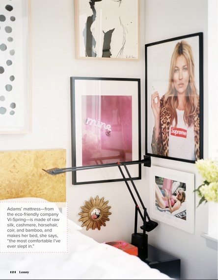
Founder by: Patrick Cline, former Domino photographer/retoucher; and Michelle Adams, former Domino market assistant.
Issue: August/September 2010.
Page count: 197.
Cover star: Callie Jenschke of Scout Designs in her home on Central Park West.
Ad on the inside cover: Mitchell Gold + Bob Williams.
Table of Contents ads: Stark, Bloomingdale's.
Size of editorial masthead (including art staff; excluding interns): 9
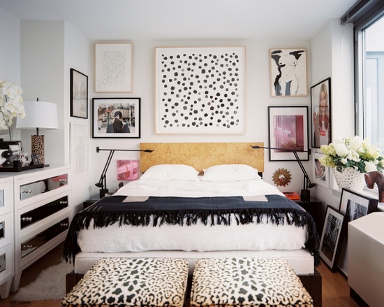
Notable contributor:Former Domino editor Tori Mellott, who's now working behind the scenes at The Nate Berkus Show.
Best of "Market" front-of-book section: Translating clothes from J.Crew, Tory Burch, and Lauren Moffatt into home furnishings and accessories.
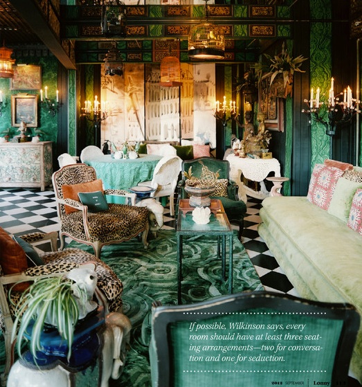
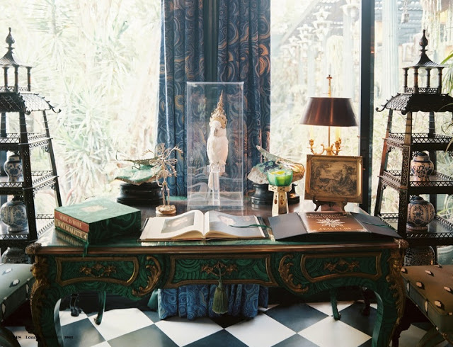
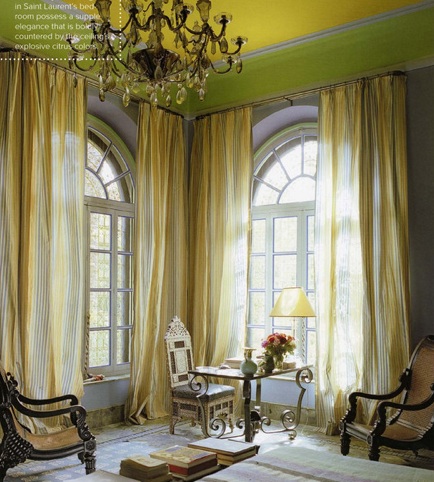
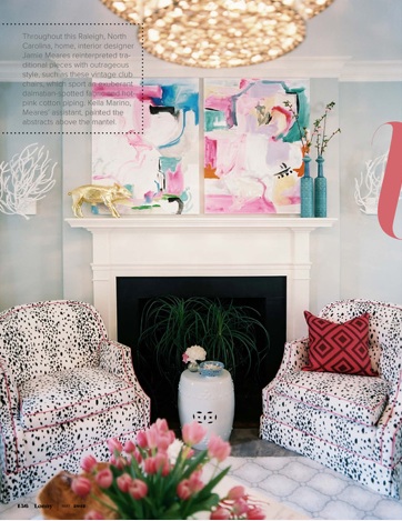
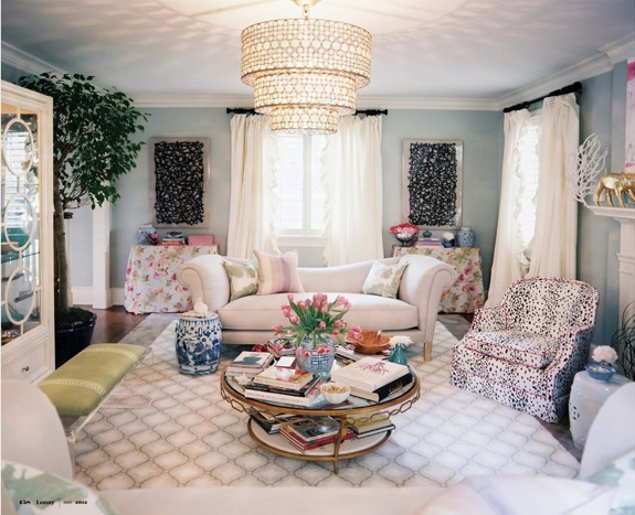
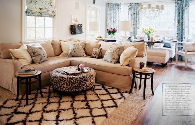
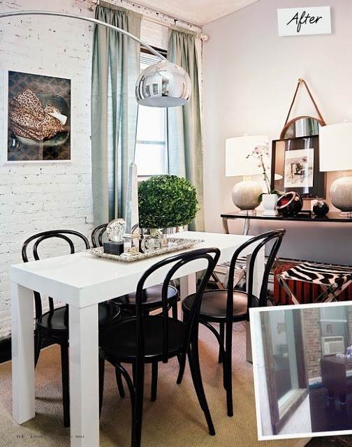
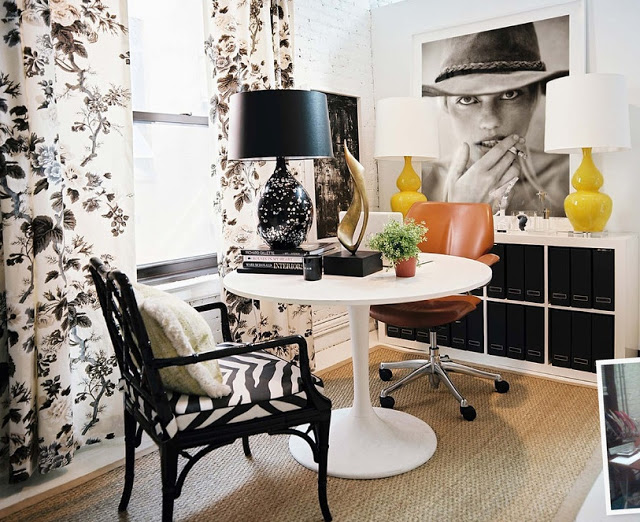
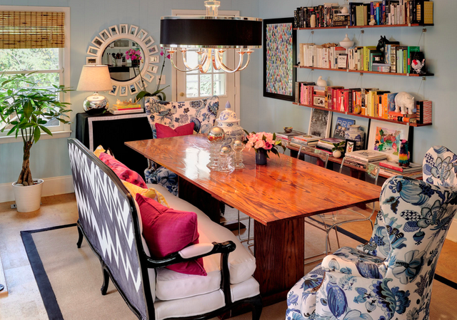
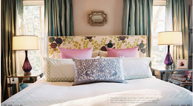
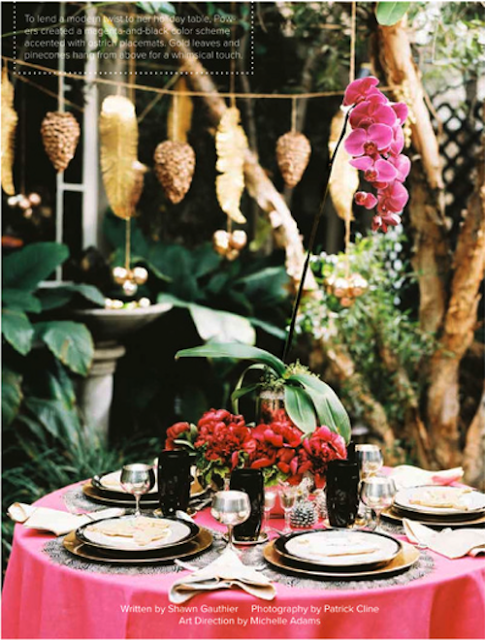
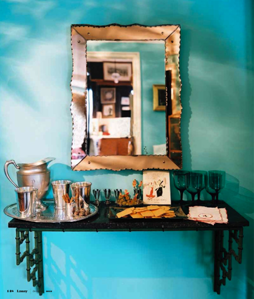
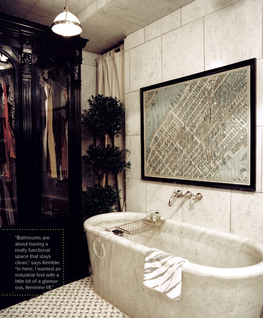
Features: Historic home and gardens in Chiswick, U.K.; Rachel Aswell's London apartment and her store, Shabby Chic; Vicente Wolf's Montauk, NY, home; a Hell's Kitchen, NYC, apartment owned by the curator of Jonathan Adler's stores; a 25-year-old's apartment in Union Square, NYC, decorated by Ryan Korban; designer Callie Jenschke's Upper West Side, NYC, apartment.

They are both so great...Is it really a competition?